Postanowiłem jeszcze bardziej “naostrzyć piłę” poprzez systematyczne przejrzenie dokumentacji do nowej wersji Windows 8. Oczywiście podczas rozwijania aplikacji wyłapałem różne zmiany i nowości czy to praktycznie czy też zaglądając do MSDN czy wybranych przykładów, ale chciałbym to jakoś sobie w pełni uporządkować i podsumować, co pozwoli mi jeszcze lepiej wytyczyć kierunki rozwoju i modernizacji mojej aplikacji. Tak więc kilka najbliższych postów będzie zawierało, to co subiektywnie zwróciło moją uwagę w postaci cytatów i krótkich komentarzy. Nie mam tu na myśli “oczywistych rzeczy” z poprzedniego wydania, raczej będą to zupełnie nowe informacje lub coś, co uznałem za warte przypomnienia.
Pewna odmienność w szczegółach UI w preinstalowanych aplikacjach w obecnej wersji Windows 8 jest bardzo klarownie w najdrobniejszych szczegółach wyłożona w dokumentacji. Już wiadomo czemu raz przyciski mają być z prawej, czemu innym razem z lewej i z prawej, jakie są grupy przycisków, gdzie ma leżeć jaki przycisk i czy w ogóle coś ma być przyciskiem w app barze, jaka jest strategia odnośnie nawigacji w odniesieniu do całej aplikacji, jakie są jej możliwe scenariusze. Zaobserwować można uwydatnienie koncepcji górnego paska nawigacyjnego czy nawet menu do szybkiej nawigacji.
Obrana obecnie strategia w szablonach Visual Studio polega na dostarczeniu predefiniowanych klas, które rozszerzają możliwości standardowych klas z API Windows 8 (głownie enkapsulacja zmiany layoutu dla różnych widoków). Oprócz pokazywanego wcześniej przeze mnie C#, można to zaobserwować także w innych językach np. Java Script.
Polecam bardzo kompleksowe przewodniki Website to Metro style app i iPad to Windows 8 Metro style app. W wyczerpujący sposób demonstrują, czym różnią się interfejsy nawet nowoczesnych aplikacji webowych i aplikacji pisanych dla iPad’a od filozofii i rozwiązań w Windows 8 Metro. Tak więc maksymalna prostota, ograniczenie elementów w UI i nawigacji do absolutnie niezbędnego minimum, aczkolwiek ukazywanie więcej szczegółów już na poglądzie grupy, zastępowanie części popularnych funkcjonalności implementacją kontraktów systemowych, co daje unifikację pomiędzy różnymi aplikacjami oraz oszczędność miejsca na ekranie (elementy UI systemowego są widoczne tylko na żądanie, nie cały czas).
Intro
Developer licenses aren’t available for Windows Server 8 Beta, so you can’t develop Metro style apps on that operating system.
You can also build your own reusable Windows Runtime components using JavaScript, C++, C#, or Visual Basic.
Metro style apps are designed to be touch first.
Do not terminate the app when it is moved off screen. Do not offer users ways to terminate your app.
Manifest
- Application UI. Configure UI settings, including the logo, splash screen, and initial orientation.
- Content URIs. Specify URIs that your app either can or can't access.
The functionality for projects for Metro style apps built using XAML in Blend is preview quality rather than beta quality. You can use Blend for evaluation purposes, but you may receive more error messages and need to use more workarounds than would be typical in a beta release.
In addition to the features in Blend, the XAML designer in Visual Studio has been updated. The XAML designer now shares common UI components with Blend for a more consistent experience and more consistent handling of project files.
When you first run or debug a Metro style app on a remote computer or device that’s directly connected to your development machine, you are prompted to install the remote debugging tools and a separate developer license on the remote machine.
Developer license: To run any of these cmdlets, you must have a valid Windows Live ID.
The web context is where externally downloaded code runs. You must use an iframe element to run code from the web.
You can't use ActiveX controls.
You can use the close gesture or Alt+F4 to close the app.
When you run a Metro style app written using JavaScript, Internet Explorer is rendering the HTML. But when you run a Metro style app, Internet Explorer is hosted in an entirely different process than when you browse the web. Internet Explorer runs in the WWAHost.exe process inside of an app container. When WWAHost runs the app, the fragment loader takes the HTML, CSS, and JavaScript in (or linked in) itemsPage.html and injects it into the default.html page that is the start of your app.
Capabilities:
- enterpriseAuthentication - Allows an app to connect to intranet resources that require domain credentials.
- documentsLibrary - Your app cannot access Document Libraries on HomeGroup computers.
- privateNetworkClientServer - Allows inbound and outbound access from your app to the user's trusted networks such as home and enterprise networks.
- removableStorage - Allows your app to access removable storage devices, such as an external hard drive or USB flash drive, and to add, change, or delete files. Your app can access only file types that it has declared in the manifest. Your app can't access removable storage devices on HomeGroup computers.
LayoutAwarePage is an implementation of Page that enables important functionality for Metro style app development:
- The mapping of application view state to visual state lets the page adapt to different resolutions, orientations, and views.
GoBackandGoHomeevent handlers support basic navigation.- A default view model gives you a simple bindable data source.
The Frame control hosts Pages, and has a navigation history that you can use to go forward and back through pages you've visited.
The Navigate(TypeName, Object) method lets us navigate and pass a data object to the new page.
To add an app bar in XAML, we assign an AppBar control to a Page's TopAppBar or BottomAppBar property. We'll add a top app bar with a button to navigate to the detail page. The StandardStyles.xaml file contains a variety of app bar button styles for common scenarios.
We can control how and when the app bar is shown and dismissed by setting the IsSticky and IsOpen properties. We can also respond to the app bar being opened or dismissed by handling the Opened and Closed events.
The basic splash screen works well for our blog reader, but you can also extend the splash screen using the properties and methods of the SplashScreen class. You can use the SplashScreen class to get the coordinates of the splash screen and use them to place the first page of the app. And you can find out when the splash screen is dismissed so you know it's time to start any content entrance animations for the app.
Developing with C++
You're still creating apps that are compiled to native machine code by the Visual C++ compiler. Metro style apps in C++ don't execute in a managed runtime environment.
When you use Windows Runtime objects, you're (typically) using C++/CX, which provides special syntax to create and access Windows Runtime objects in a way that enables C++ exception handling, delegates, events, and automatic reference counting of dynamically created objects. When you use C++/CX, the details of the underlying COM and Windows architecture are almost completely hidden from your app code. But if you prefer, you can program directly against the COM interfaces by using the Windows Runtime C++ Template Library.
App.xaml.g.h, App.xaml.g.cpp - App.xaml.g.cpp contains the app's main method and some associated boilerplate code. App.xaml.g.h contains code that enables the operating system to load the .xaml files into memory at run time and create the object graph.
StandardStyles.xaml - Contains predefined item templates, styles, and other elements that define the look and feel of a Metro style app. Don't modify the styles and templates in-place. However, you can base custom styles on these (by using the BasedOn attribute), or copy and paste them into other pages, give the copy a different name, and then modify the copy.
BlankPage.xaml.g.h, BlankPage.xaml.g.cpp - Contain the automatically-generated partial class definition for the BlankPage and App classes, and the member variables that are generated for each XAML element that has an x:Name attribute. Don't modify these files.
XamlTypeInfo.g.h - The C++ file that the XAML editor generates to enable the Windows Runtime to recognize and load any custom types that are defined in your app and are referenced in any XAML files. Don't modify this file.
The partial and ref keywords are obviously not ISO standard C++. They are component extensions that you use specifically for creating instances of Windows Runtime types. The ref keyword indicates that the class is a Windows Runtime reference type; using ref saves you from having to write a lot of next-generation COM code. In the class member declarations, notice an Object^ variable and a Grid^ variable. The "^" symbol is known as a "hat" and it means "a handle to an object." Use it instead of "*" when you create Windows Runtime types in dynamic memory. You can also use the C++ auto keyword; the compiler will infer the type.
In the most basic sense, a ref class is a COM object that implements the IInspectable interface and whose lifetime is managed by a smart pointer. The Windows Runtime defines a language-agnostic abstract binary interface (ABI) that runs natively in machine code, not through a virtual machine. C++/CX makes it possible to program against this ABI in an idiom that is much more like modern C++ than like old-school COM programming.
You can develop a complete game using Microsoft Visual Studio 11 Express Beta for Windows 8, but the Ultimate version has more extensive graphics debugging support and more tools for asset management.
VS 2011 projects: Direct3D Application
Developing with JS
A few of the WinJS events and functions related to the app lifecycle:
The navigation model defined in the Grid, Split, and Navigation Application project templates is the recommended navigation model for Metro style apps built for Windows using JavaScript. In this model, logical HTML pages, implemented as HTML fragments, provide the pages for the app. The logical pages are loaded into the app context as needed, typically in response to user actions. Web developers often refer to this type of navigation model as single-page navigation. The navigator.js file implements the navigation model.
In this navigation model, a DIV element that's declared as the app's navigation control provides the container for all the app's pages. The DIV element uses the WinJS data-win-control attribute to declare itself as the navigation control, and this control provides the navigation model for the app. All page content is loaded into this DIV.
WinJS.Namespace.define("appName", { PageControlNavigator: WinJS.Class.define( // Constructor function. function (element, options) { // Initialization code. }, // Members specified here.});
<div id="contenthost" data-win-control="appName.PageControlNavigator" data-win-options="{home: '/html/itemsPage.html'}"> </div>
The constructor function performs initialization for the navigation control. Some important tasks include setting handlers for WinJS events, such as the WinJS.Navigation.onnavigated event, and invoking WinJS.Navigation.navigate to load the home page of the app. (The home value is specified in the contenthost DIV element, in a data-win-options attribute.)
When you use page controls, there's a set of predefined methods that the library calls automatically, in a predefined order. The WinJS.UI.Pages.define function exposes these methods for implementation. The ready function is called when the page fragment is loaded and fully processed. This function should contain the initialization code for each page. The code is unique for each page.
The internal page control functions are called in this order: load, init, render, processed, and ready. Typically, only the ready function is implemented in a Metro style app.
In some templates, particular functions in the JavaScript files of the HTML pages might modify the Back button history, depending on the current view state. For example, in the Split Application template, the app modifies the Back button history if the app is in a template-defined view state called a master/detail view.
VS JS Item Templates
Page Control - Contains no content or behavior, but implements the recommended navigation model for Metro style apps , which is also implemented in the Grid, Split, and Navigation project templates. We recommend using this item template when you add pages to these project templates.
The HTML5 canvas element doesn’t support accessibility. Because it doesn’t provide any way to expose accessibility information for its content, avoid using canvas unless it is absolutely necessary. If you do use canvas, treat it as a custom UI element.
Windows 8 Consumer Preview supports only free apps and free in-app offers. Trial periods and in-app offers are supported, so you can use and test these features in your app even though the price is free.
Navigation patterns
Hierarchical system: hub pages –> section pages –> detail pages
Flat system: navigation bar (at top) –> switching (direct links or nav bar without back button and navigation stack)
Navigating with the edge swipe: showing app bar, switching between apps, showing charms
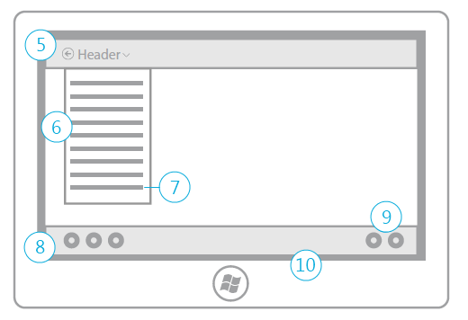
5. Nav bar - The navigation bar contains transient access to navigation controls or to other areas of the app. The navigation bar is used primarily for navigating sections or pages of an app that use the Flat navigation pattern. It can also be used along with the Hierarchical pattern, in lieu of the header menu, as a means for providing global navigation controls.
6. Header menu - The header menu is available from anywhere in the app, and allows users to quickly jump from one section of the app to another
7. Home link - The home link, located at the bottom of the header menu, is a quick way to get back to the root of the app.
8. App bar - The app bar is used primarily as a commanding surface, but it can also be used to alter the way in which content is being viewed. Switching views, pivoting, filtering and sorting can all be done by using the app bar. Don't use the app bar for navigating from one place in the app to another. All app bar items should act on the content currently in view.
9. View/Sort/Filter - The best place for them to reside is in the app bar
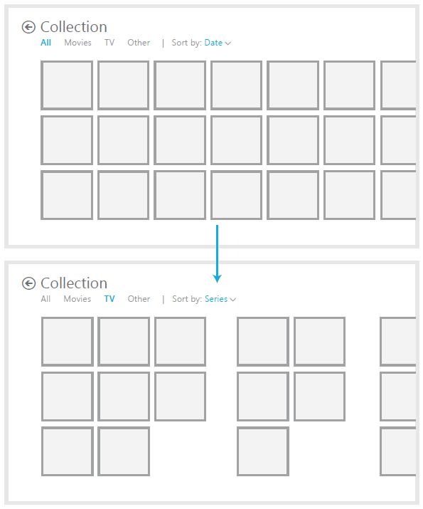
Use on-canvas controls for filtering, pivoting, or sorting when finding an item is a primary task, like in a collection or search result page. Controls should go into the app bar, if the focus of the app is on browsing for content, like a magazine or shopping app.
Command patterns
The app bar displays command sets as a unit, with a divider between the sets.
1. Place persistent commands on the right. Start by placing default commands on the right side of the app bar. If there are only a few commands, the app bar may end up with commands only on the right.
2. Use the edges. If there is a larger number of commands, separate distinct command sets on the left or the right to balance out the app bar and to make commands more ergonomically accessible.
3. Show/hide disabled commands. Commands that are not relevant in certain circumstances should be hidden.
4. Insert selection commands. Commands that appear as a result of the user making a selection go on the far left, sliding over any commands that may have been there.
Use standard placement for common commands
Selection commands Commands related to your selection always appear on the far left, whether they are contextual commands that appear on selection, or commands that affect your selection.
New Item command If your app calls for a "New" command, where any new type of entity is created (add, create, compose), place that command against the right edge of the bar. The + glyph should only be used to represent the "New" command, and it should not appear anywhere else in an app bar.
Delete commands Use Delete/New if your app is about managing individual entities that may persist outside of your particular application, like in a mail or camera app.
Remove commands Use Remove/Add if your app is about managing a list, such as a to-do list, a list of cities in a weather app, or a list of bookmarked restaurants.
Clear commands Use clear if you are taking a destructive action on all possible items. Use the command label to be explicit about what the command will act on, such "Clear selection."
Touch patterns
People often touch with more than one finger and don’t even realize it. That's why touch interactions shouldn’t change radically based on the number of fingers touching the screen. Just like the real world, sliding something with one or three fingers shouldn't make a difference.
Windows 8 Touch language
Press and hold to learn - this touch interaction causes detailed information or teaching visuals (for example, a tooltip or context menu) to be displayed without a commitment to an action. Anything displayed this way should not prevent users from panning if they begin sliding their finger.
Tap for primary action
Slide to pan - Slide is used primarily for panning interactions but can also be used for moving, drawing, or writing. Slide can also be used to target small, densely packed elements by scrubbing (sliding the finger over related objects such as radio buttons).
Swipe to select, command, and move - Sliding the finger a short distance, perpendicular to the panning direction, selects objects in a list or grid (ListView and GridLayout controls). Display the AppBar with relevant commands when objects are selected.
Pinch and stretch to zoom (+ SemanticZoom)
Turn to rotate - Rotating with two or more fingers causes an object to rotate.
Swipe from edge for app commands - App commands are revealed by swiping from the bottom or top edge of the screen (AppBar)
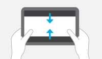
Swipe from edge for system commands - Swiping from the right edge of the screen reveals the charms, which contain system commands. Swiping from the left edge displays previously used apps. Swiping from the top edge to the bottom edge of the screen displays docking or closing commands.
Users can perform direct manipulations like the slide-to-pan, pinch-to-zoom, and turn-to-rotate interactions simultaneously and with any number of touch points.
Windows 8 Touch posture
- Interaction areas:Because slates are most often held along the side, the bottom corners and sides are ideal locations for interactive elements.
- Reading areas:Content in the top half of the screen is easier to see than content in the bottom half, which is often blocked by the hands or ignored.
Windows 8 Touch targets
7x7 mm: Recommended minimum size - 7x7 mm is a good minimum size if touching the wrong target can be corrected in one or two gestures or within five seconds. Padding between targets is just as important as target size.
When accuracy matters - Close, delete, and other actions with severe consequences can’t afford accidental taps. Use 9x9 mm targets if touching the wrong target requires more than two gestures, five seconds, or a major context change to correct.
When it just won't fit - If you find yourself cramming things to fit, it’s okay to use 5x5 mm targets as long as touching the wrong target can be corrected with one gesture. Using 2 mm of padding between targets is extremely important in this case.
Website to Metro style app (very cool guideline!)
Layout & navigation
- Most websites use well established layout patterns. The homepage design has UI to support navigation (both header and footer), utility components (sign-in, search), and access to other content (blog and news). These are common elements for websites, but they distract users from focusing on the most important task: finding a food truck that's nearby.
- When designing the Metro style app home screen, we chose to bring more food truck info to the top level to provide users more context and create a more engaging interface.
- The most recognizable characteristic of a typical Metro style app silhouette is the region of the screen dedicated to content, with heavy margins on the top, bottom, and right edges. The left margins and the items peeking in from the right serve as a visual indication that the content pans from right to left. The top and bottom margins provide a visual rail to anchor the content.
Commands and actions
Frequently used commands are near the edges so that they are more comfortable to reach.
Contracts, Touch, Scalling and views, Notifications
iPad to Windows 8 Metro style app
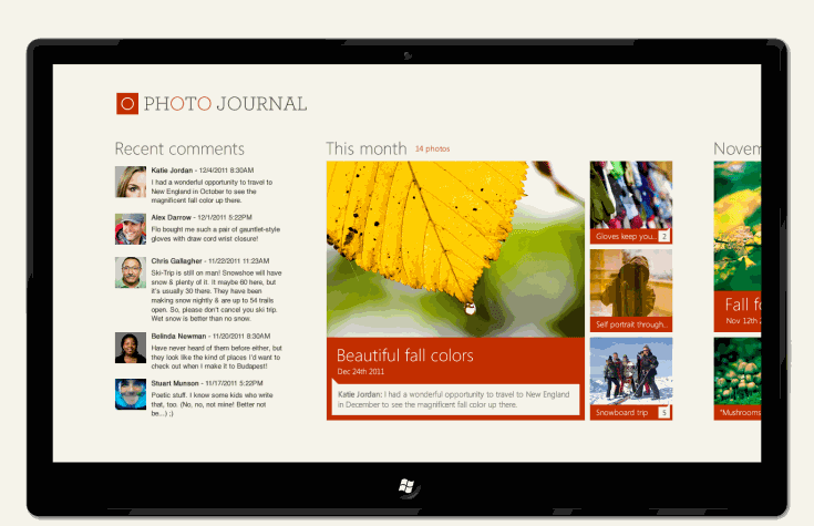
We chose to bring more pictures and social content to the top level, to provide users more context. We removed borders from the pictures. Each month is represented by multiple photos, their titles, and the number of comments associated with the photos. Users can see more highlighted content for a month on the home screen.
We flattened the navigation hierarchy so more content is accessible via the app's hub screen, eliminating the need for navigation.
We combined the comment and photos in one view to eliminate the need for a tabbed user interface. To see the entire list of comments, users can tap on the group header labeled Recent comments.
Swiping from the top edge toward the bottom edge of the screen lets you dock or close apps.
In snap view, a user pans vertically to get to more content because it is more comfortable to pan along the long edge. This is different than the horizontal panning in full view, which is also optimized to pan along the long edge.
c.d.n


Brak komentarzy:
Prześlij komentarz